Create Heat Map Chart
Skip Widget from Event Filtering: This video contains how to create heatmap chart in OPNBI.
This document contains information on a feature Heatmap Chart. The Heatmap Chart is a graphical representation of two-dimensional data where the values are represented with gradient or solid color variations. The data points are rendered as Heatmap cells using Scalable Vector Graphics (SVG) or canvas UI rendering.
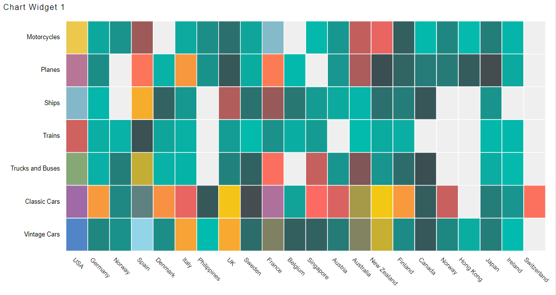
In this document we are Creating Heatmap Chart widget in Other Chart. Using heatmap we can represent data against 2 categories. For example, when we use bar or column chart, we can represent sales value against one category axis where as here in heat map we can represent sales value against 2 categories i.e. against country and productline.
Kindly follow below steps to learn how to create heat map:
Click on Hamburger Icon.
Click on (+) icon, from Dashboard tab.

The Create Dashboard Dialog box will pop up on screen. Enter Dashboard Name as shown in Figure above.
Click on Create button after entering Dashboard Name in dialog box.
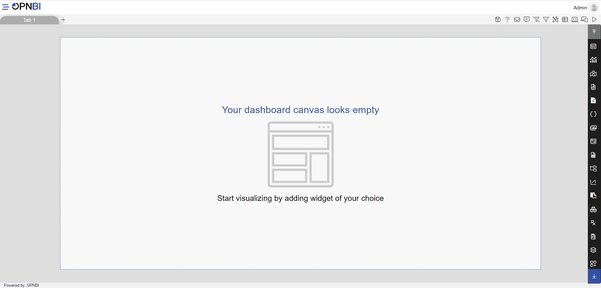
You will see an Empty Dashboard, As shown in figure below:

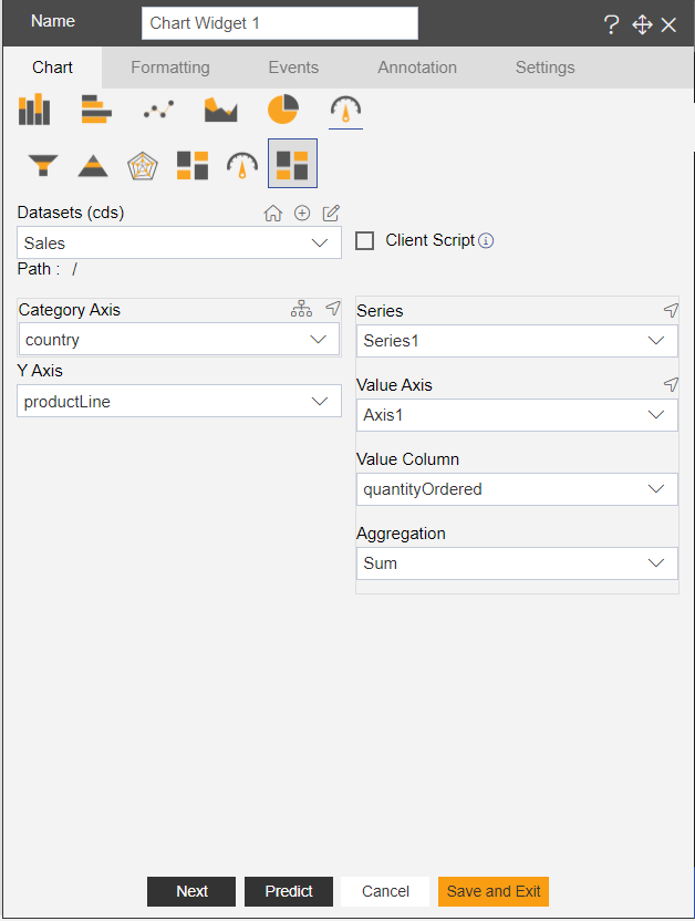
From Right Vertical Menu, Select the Chart widget, The Edit menu box appears as you click on Heatmap in other chart icon. And a widget gets added automatically in dashboard canvas.
Enter Following details in chart controls:
- Dataset: sales.ds
- Category Axis: country
- Y Axis: productLine
- Value Column: quantityordered
- Aggregation: sum
Fill above details in edit box, As Shown in figure below.

Click on Preview and Save and Exit.
Now, match your Heat Map chart with the below example, it should look like the figure below:

In order to understand in detail about other features, click on the following links:-